Back to the marketplace

Visualize

By Context Skill Data and analysis

Draws charts, timelines and comparisons inline in chat.
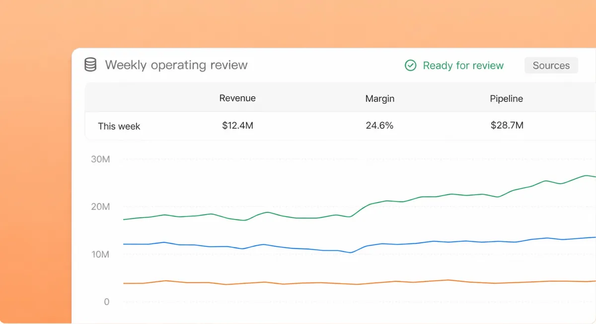
Deliverables produced by an agent in the workspace
Live workspace demo

What it does

Draws bars, columns, timelines, heatmaps and stat tiles inline in chat, and knows when a table or a sentence is the better answer.


How to use it

  1. 1Ask to see the comparison or the trend.
  2. 2Read the chart in the thread.
  3. 3Attach it to a ticket or a document.

More in Data and analysis

Warehouses, dashboards and answers from the numbers.

KPI sheet desk

Builds the weekly KPI sheet and chart pack from your warehouse.

By Context Template

Get

Spreadsheet cleanup

Cleans, dedupes and reshapes a spreadsheet and documents every change.

By Context Template

Get

Ask the warehouse

Answers questions against your data warehouse in plain language, with the query shown.

By Context Template

Get

Spreadsheets

Creates, reads and edits Excel spreadsheets.

By Context Skill

Get

Spreadsheet templates

Twenty-seven Excel starting points: budgets, trackers, dashboards and plans.

By Context Applet

Get

Data analysis

Fab telemetry into insights

By Context Agent

Get

Portfolio analysis

Performance & risk attribution

By Context Agent

Get

Performance analytics

KPIs & trend reporting

By Context Agent

Get

Data analytics

Cross-agency insights

By Context Agent

Get

Data analysis

Cross-functional insights

By Context Agent

Get

Runs inside your perimeter, under your permissions.